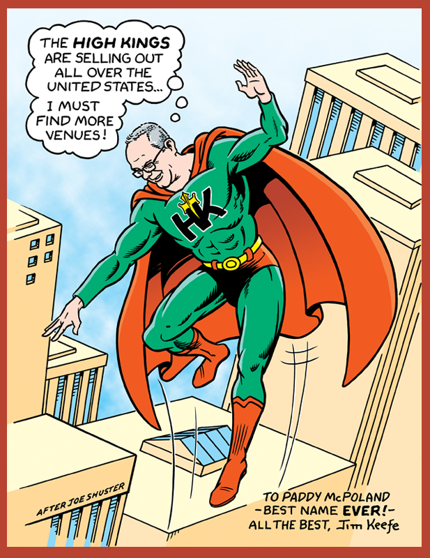
Here’s a quick overview of an illustration I just did of the High Kings.
I used the following photo for reference. It was a pic the High Kings had posted that wasn’t a posed shot and also included instruments, which appealed to me.
For the purpose of my drawing, I didn’t want the foreground figure to be so much larger that it would dominant the picture, so I moved the band members around a little for a tighter layout. I did that by moving the figure on the left over, but also moving the characters in the foreground and background closer to each other so they’re also closer in size than they are in the photo.
After my first run at inks I erase the pencils and see where I’m at, which involves getting better picture reference for aspects of the photo that were on the periphery and slightly out of focus. Then it’s a matter of tightening up the drawing and finishing up the inks.
Here’s the art after being scanned. Digital is where I have another pass at tightening up anything that still bothers me. In this case it was the hand holding the neck of the guitar in the foreground and the strings on said guitar.
For coloring I wanted to try something a little different. Recently I’ve really been taken by the art of cartoonists like Rosemary Valero-O’Connell.
Her strong and effective use of a monochromatic color palette was something I definitely thought would work well for the High Kings pic.
So first off was changing the black line to a dark green. After that I kept it simple with just a mid-tone and a lighter tone.
Last but not least I needed something to frame the image. As the High Kings are one of the most popular Irish folk bands around I went with the Irish flag. The High King’s logo thrown in for good measure and it’s all finished!
Hope you enjoyed this little window into the thought process that goes behind a drawing. Have to wrap this up as I’m heading off tonight to see the High Kings here in the Twin Cities at the Cedar Cultural Center (sold out of course) – so that’s all for now. Sláinte!